Patient App
Giving patients a place in the conversation.
Opportunity
An opportunity worth pushing for
Heidi started as a patient-facing product, but after pivoting towards clinicians in 2023, we hadn’t meaningfully reinvested in the patient experience. Patients were already hearing about Heidi, seeing it used in consultations and discussing it online, yet had little agency over their own experience.
I’d been advocating for patients for years, informed by my earlier work building a chronic-care startup. I kept bringing the opportunity into product conversations until the CEO agreed to pursue it as a new bet. The starting brief was little more than a bullet-point Slack message, so the challenge was defining what would make a first release genuinely valuable.
Direction
From ambition to a product direction
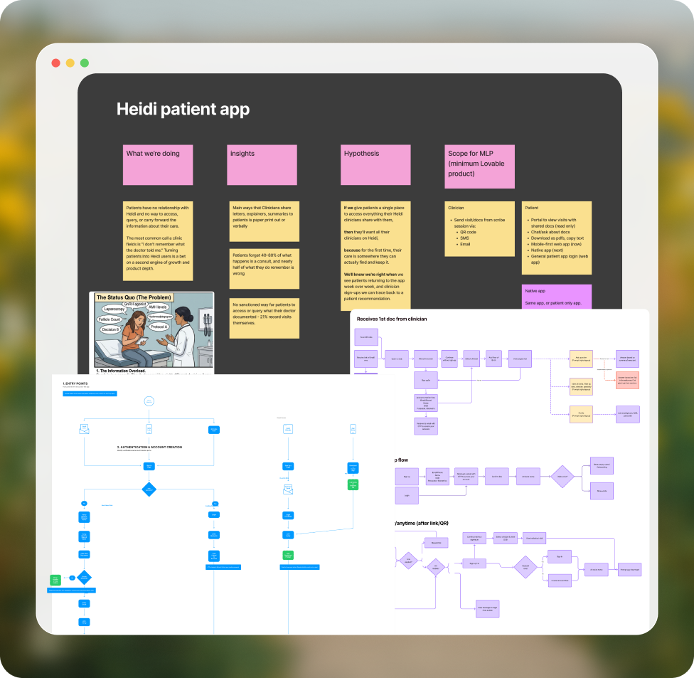
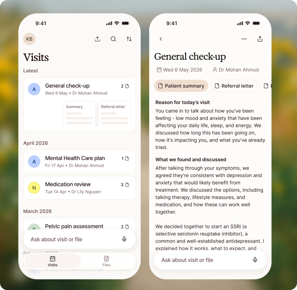
I partnered with the product designer to define our goals, map the core journeys and establish the initial information architecture. That shared foundation created clarity without prescribing every screen.
I then gave him space to own the exploration, coming back together for critiques and hands-on working sessions where my perspective could raise the craft without taking away his autonomy.
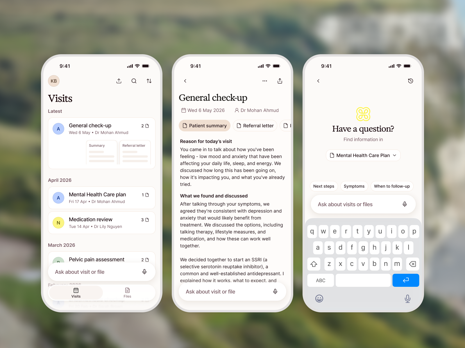
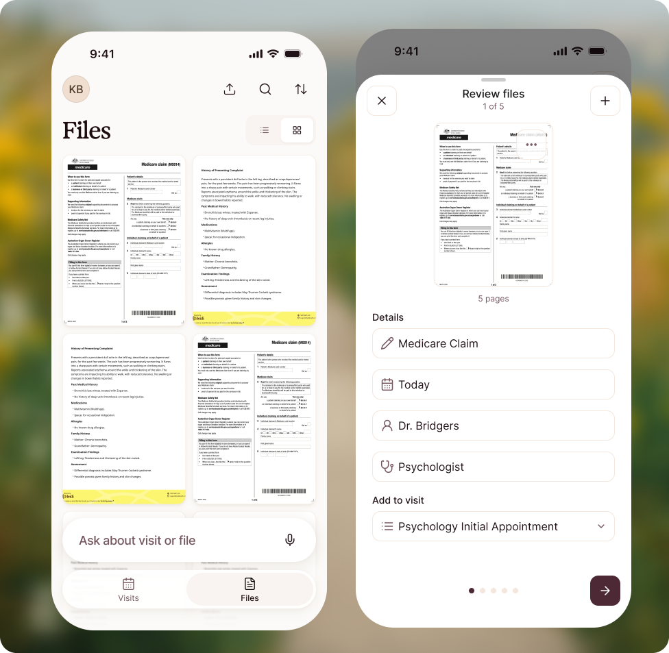
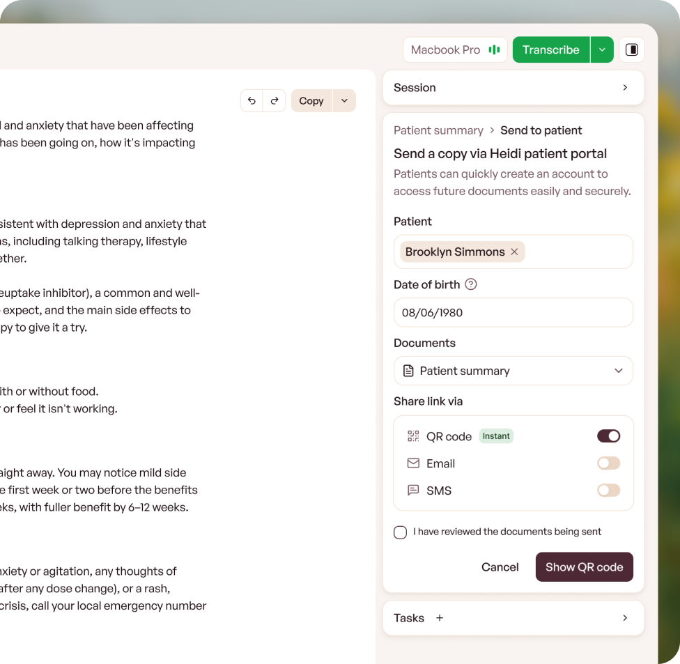
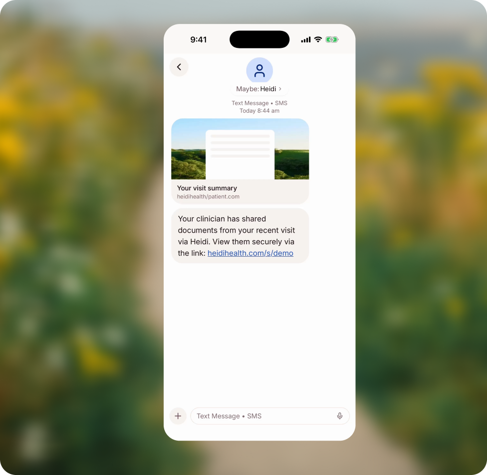
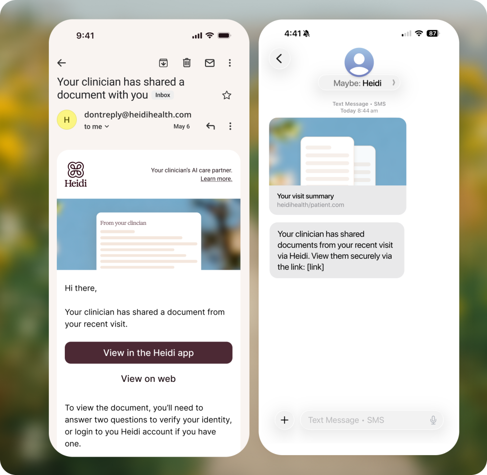
The experience centred on making health information useful: clinicians could share multiple documents with patients and their wider circle of care; patients could receive them via QR code, SMS or email; and visits, documents and summaries stayed organised in context. I also pushed to let patients upload records from outside Heidi, rather than limiting the product’s value to encounters with Heidi clinicians.
Boundaries
Keeping the ambition, reducing the risk
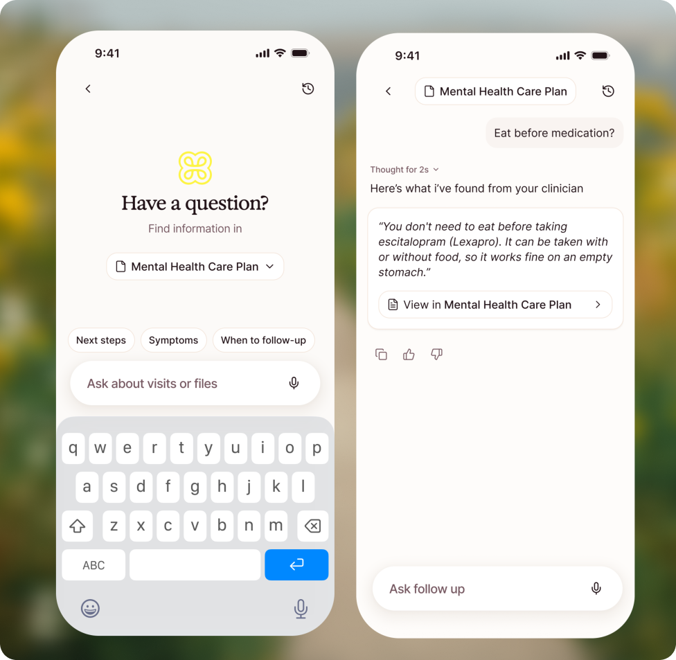
When safety concerns threatened to remove AI chat from the pilot, I challenged the trade-off. Another document portal wasn’t the opportunity; helping patients understand their health information was.
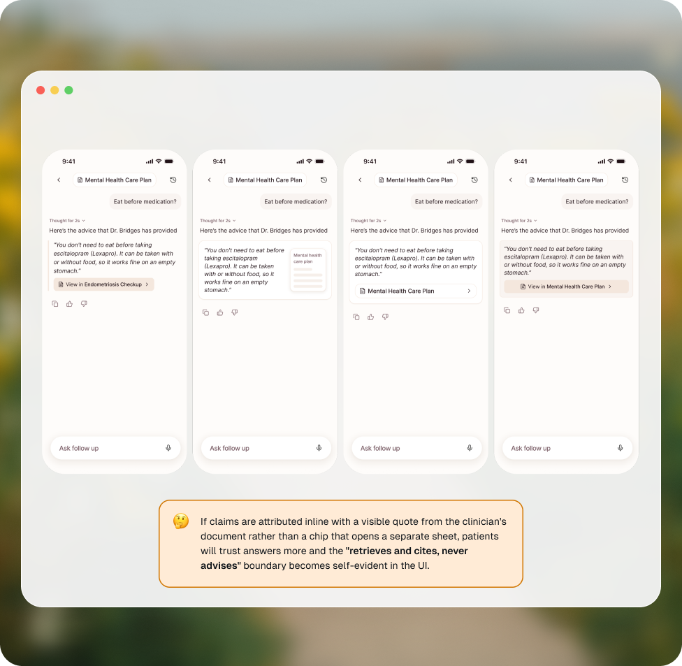
I proposed a narrower approach: retrieve answers from the patient’s own documents, with visible citations, rather than offering open-ended medical advice. I explored interaction patterns to make that boundary clear in the interface, giving stakeholders a tangible way to evaluate both the value and the risk.
“Retrieves and cites, never advises”
Access
Making access easier, not asking for more commitment
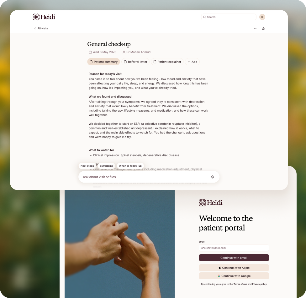
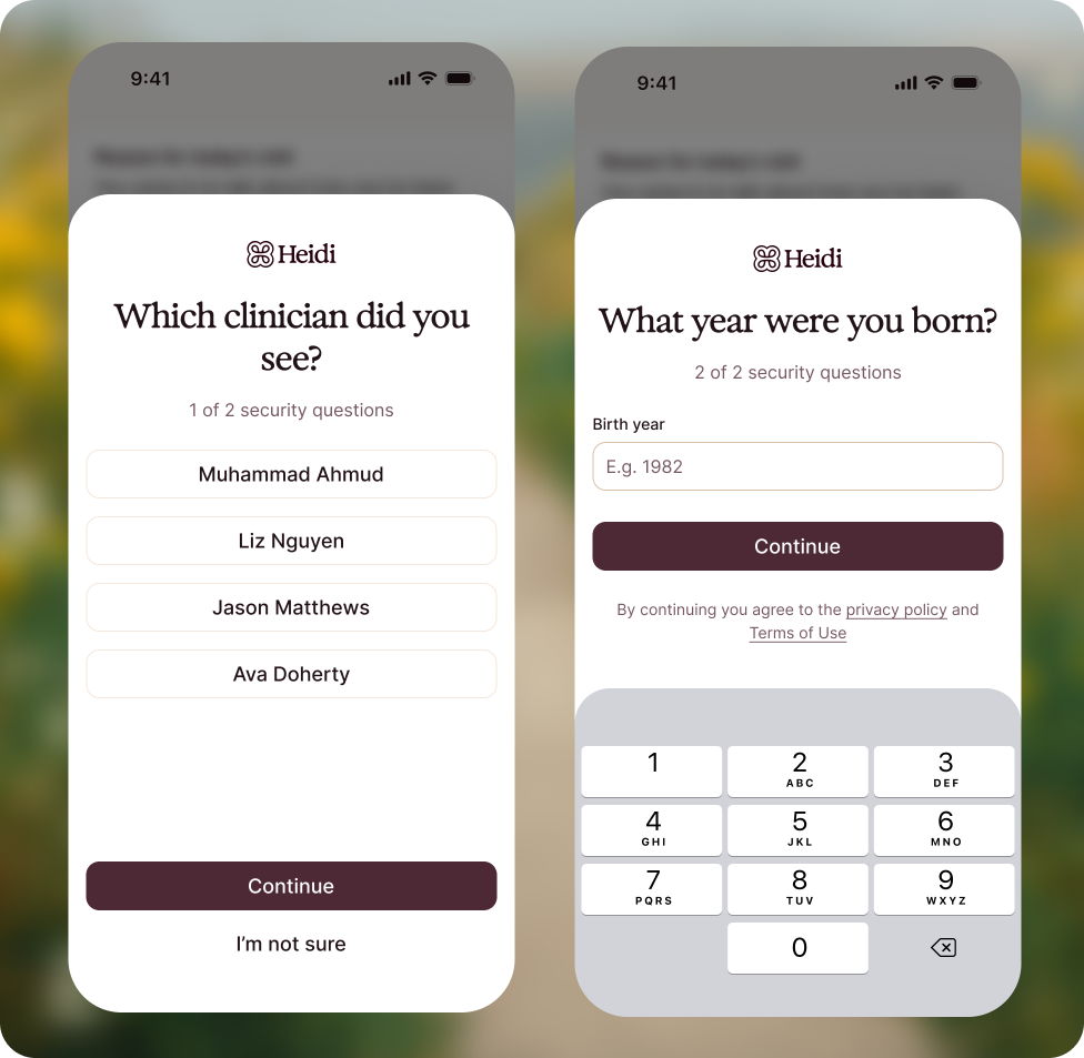
I also challenged the assumption that this had to be app-only. Requiring a download could be unnecessary friction for someone simply trying to read a consultation summary.
I advocated for a responsive web experience and took ownership of designing and building it, extending what the team was already creating while the designer continued developing the mobile product.
Leadership
Raising the bar without taking the reins
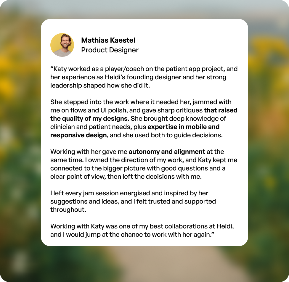
My role shifted with what the work needed: creating alignment early, stepping back to enable independent exploration, and joining the details when a problem benefited from another perspective.
We evaluated navigation alternatives against discoverability, reachability and long-term scalability, rather than optimising only for the first release.
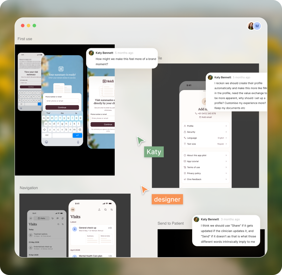
“Autonomy and alignment at the same time.”Mathias Kaestel, Product Designer
Outcome
From an idea to a pilot
What began as a loosely defined ambition became a cohesive patient experience ready for limited pilot testing.
We had a foundation for helping patients receive, organise and understand their health information — and for learning from real behaviour before expanding the product’s scope. The pilot was a first step towards validation, not a claim of proven adoption or clinical outcomes.