Heidi Scribe 2.0
Redesigning the clinical workspace to scale with a rapidly evolving product.
Context
Designing for what comes next
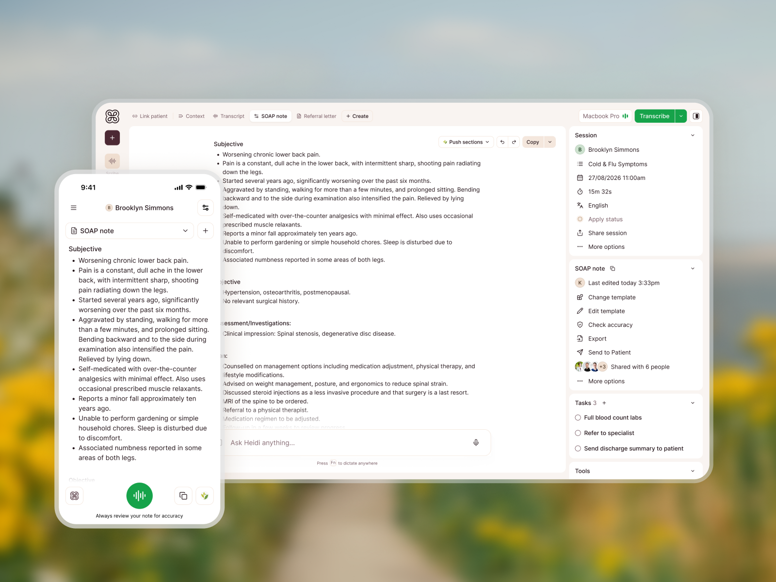
Heidi was evolving rapidly, introducing new capabilities for personalisation, collaboration, agentic AI and clinical workflows. But the core interface hadn’t kept up. Designers were finding homes for new functionality as it arrived, and the experience increasingly reflected internal product teams rather than how clinicians actually worked.
I recognised the growing complexity and initiated a redesign without waiting for a brief. The challenge was to create a system that could accommodate where Heidi was heading, without sacrificing simplicity or discoverability.
Principles
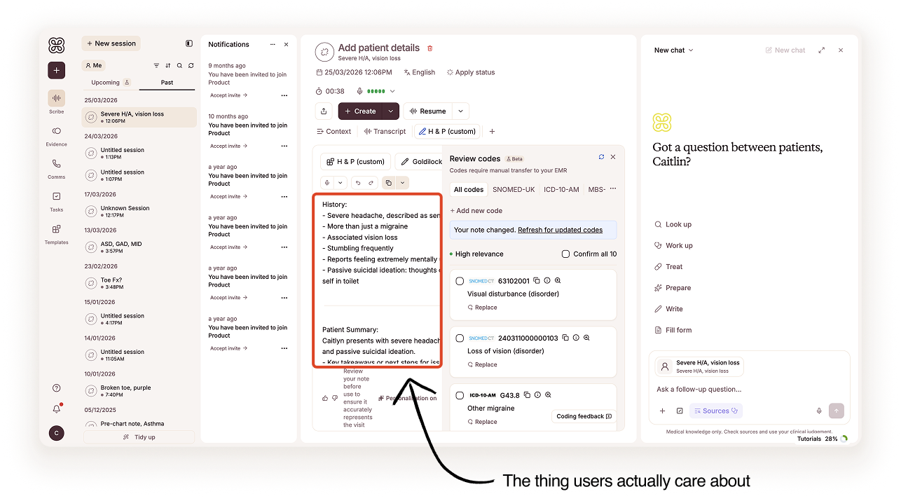
Clinicians’ content is king
The clinical note is the most important part of the experience, yet competing features were increasingly fighting for attention. I established three design principles to bring clarity to the system: Clinicians’ content is king, Place has purpose, and Intent-driven and flexible.
These principles informed a more adaptable workspace, where functionality is organised around user intent rather than internal team ownership, and clinicians can customise the experience around how they actually work.
Exploration
Finding the right mental model
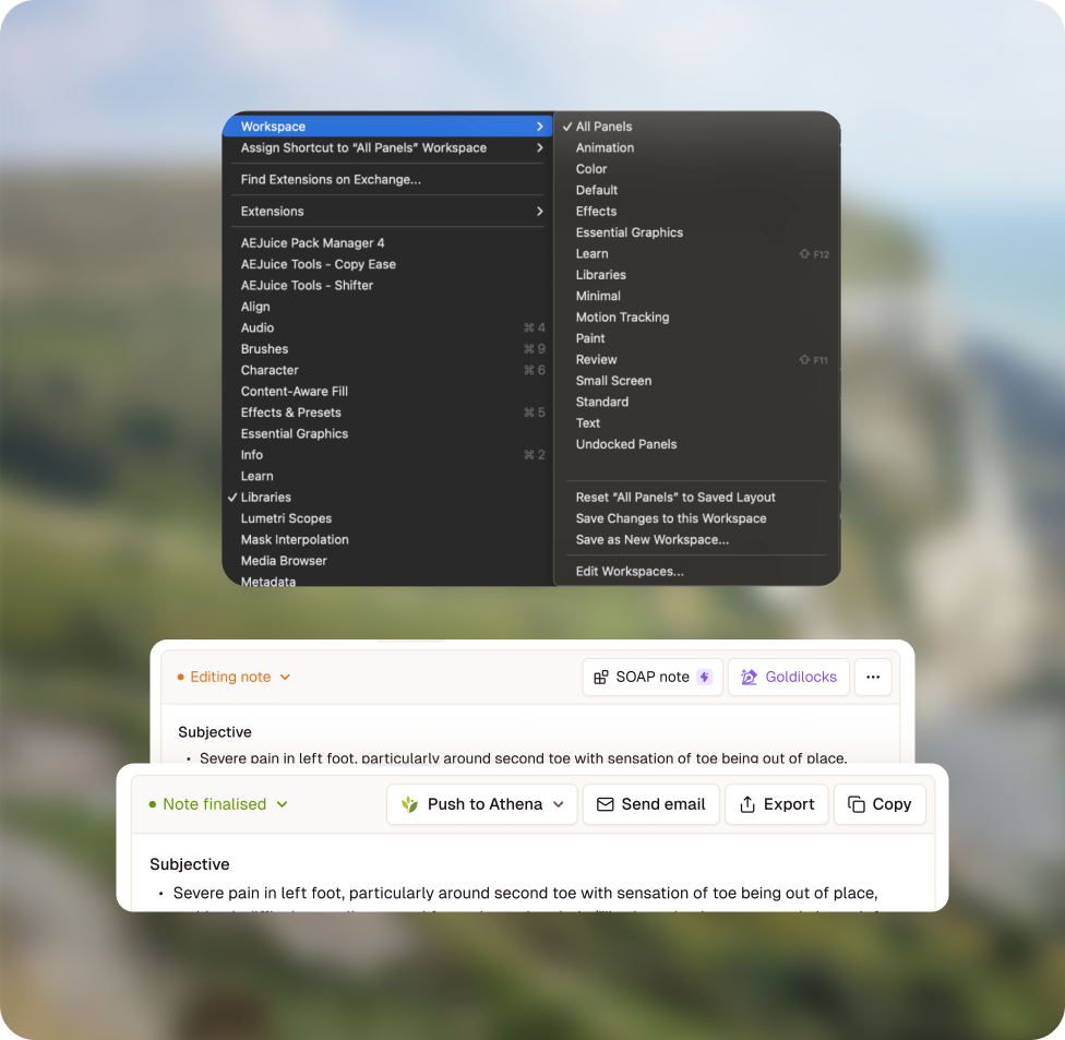
I explored distinct workspace modes, inspired by creative tools like Adobe, but clinical workflows aren’t linear. Clinicians regularly move between tasks, and collaboration means work isn’t always completed in a predictable sequence.
Feature-based tabs presented another problem: reinforcing product silos, encouraging an ever-growing list of icons, and making discoverability dependent on recognition.
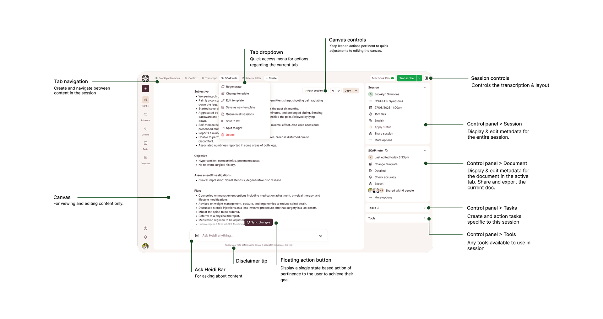
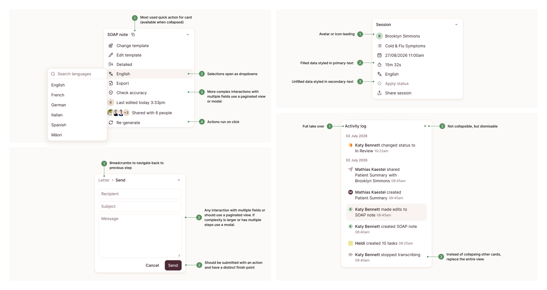
Instead, I designed a flexible control panel that gives functionality a logical home without prescribing how clinicians should work. Visible states make controls easier to understand, less-used settings move into More options, and the entire panel can collapse for an uninterrupted view of the note.
Context in reach
Keeping context in reach
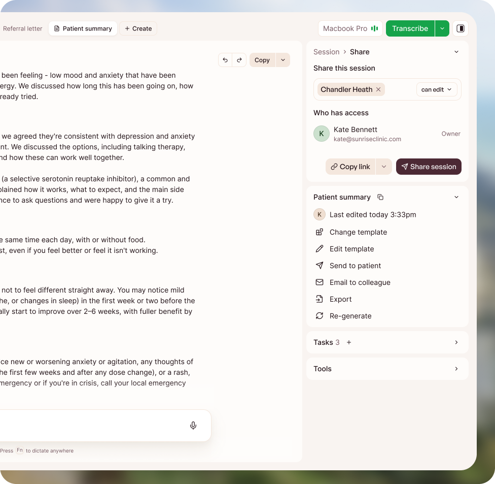
Previously, many interactions opened in full-screen modals, taking clinicians away from their note at the very moment they needed to reference it. Tasks like sending letters or sharing sessions often depend on information within the clinical record.
I designed contextual panels that keep the note visible while clinicians complete related actions, alongside a dedicated Ask Heidi mode that brings AI into the centre of the experience without removing direct control. Clinicians can switch between agentic and manual workflows without losing context.
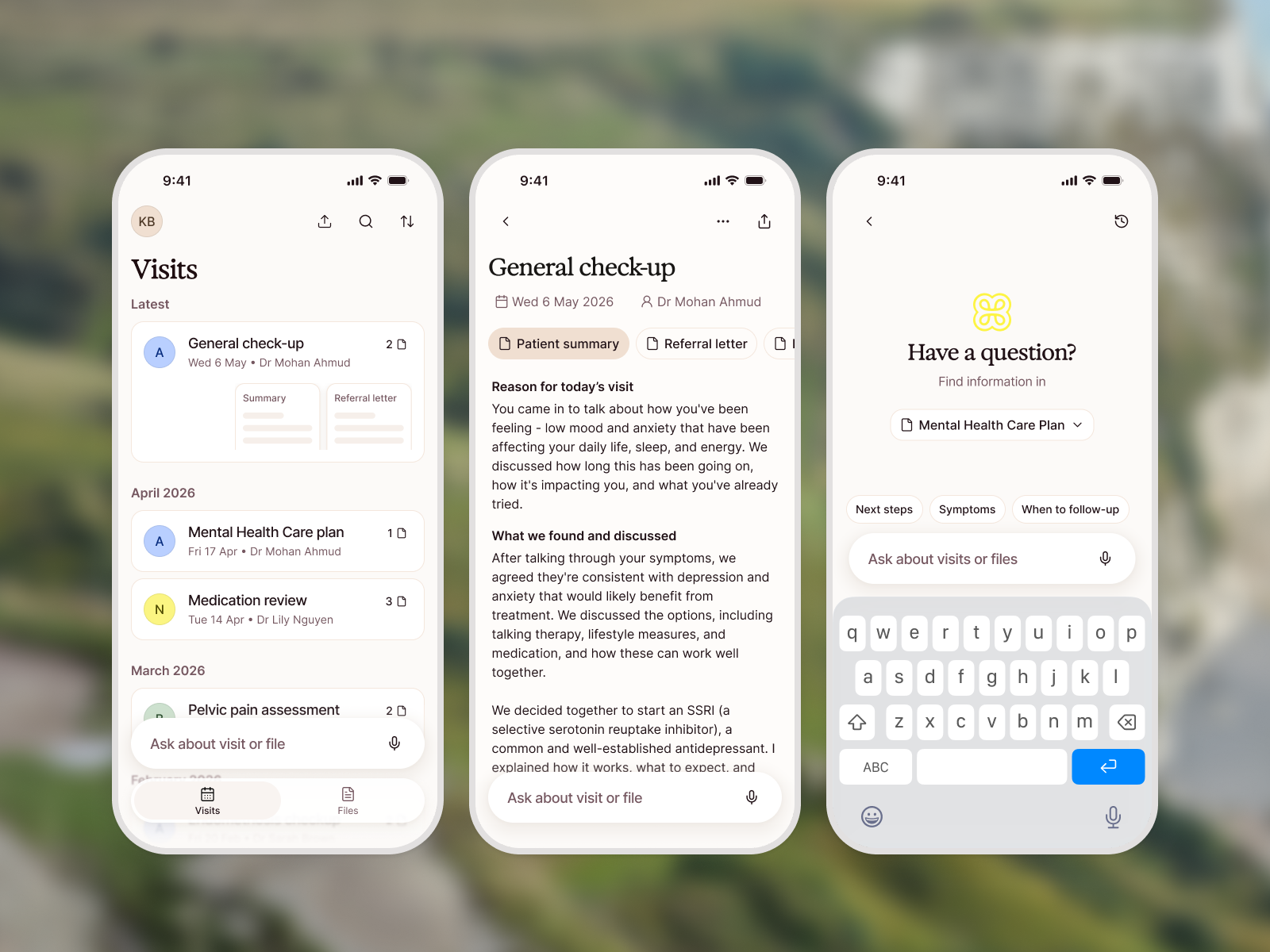
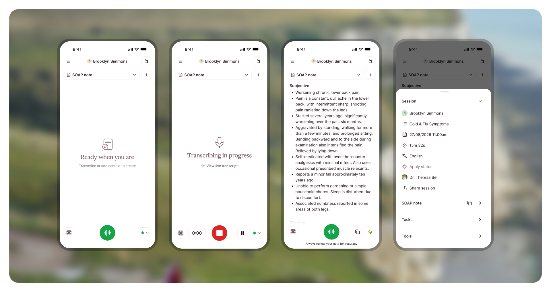
The same patterns carry to smaller screens: the canvas stays dominant while controls compress into a bottom sheet.
How we build
Shaping how we build, not just what users see
Creating a scalable system meant aligning the people building within it. I led the overall design direction, then brought designers into the process through workshops, collaborative working sessions and real projects that challenged and refined the architecture.
With PMs and engineers, I worked through competing priorities and established shared patterns that could support future functionality without fragmenting the experience. This required balancing a clear design vision with the flexibility for other teams to contribute and take ownership.
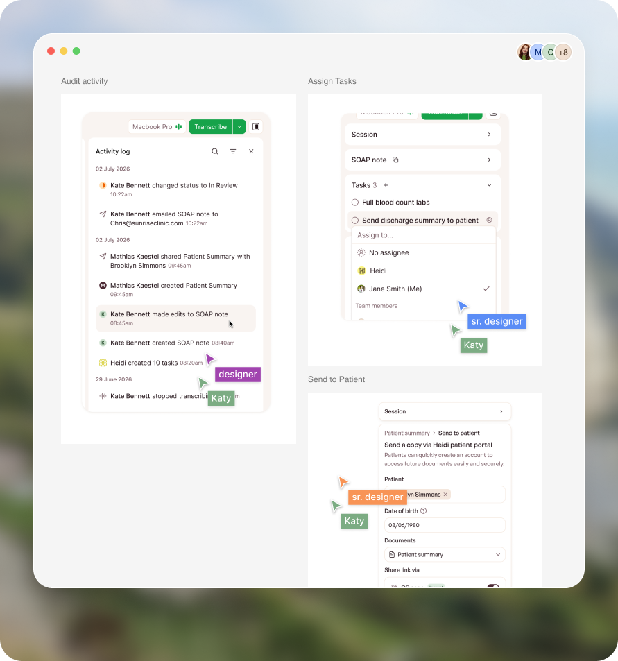
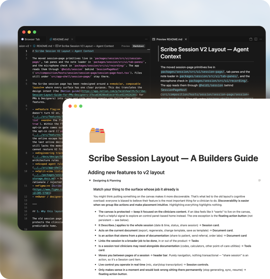
To protect the system beyond the initial release, I documented its principles, patterns and rationale, and created Markdown guidance for AI coding agents to help teams build within the architecture from the outset. I also established reviews, cross-functional workshops and engineering champions to reinforce the system as new features were developed.
The goal wasn’t just consistency in what clinicians saw, but a more considered, scalable way for Heidi’s teams to design and build together.
Rollout
Bringing everyone along
A redesign of this scale needed more than a handover. I supported an opt-in rollout through Heidi Labs, preserving familiar controls and giving clinicians time to adapt while we resolved issues.
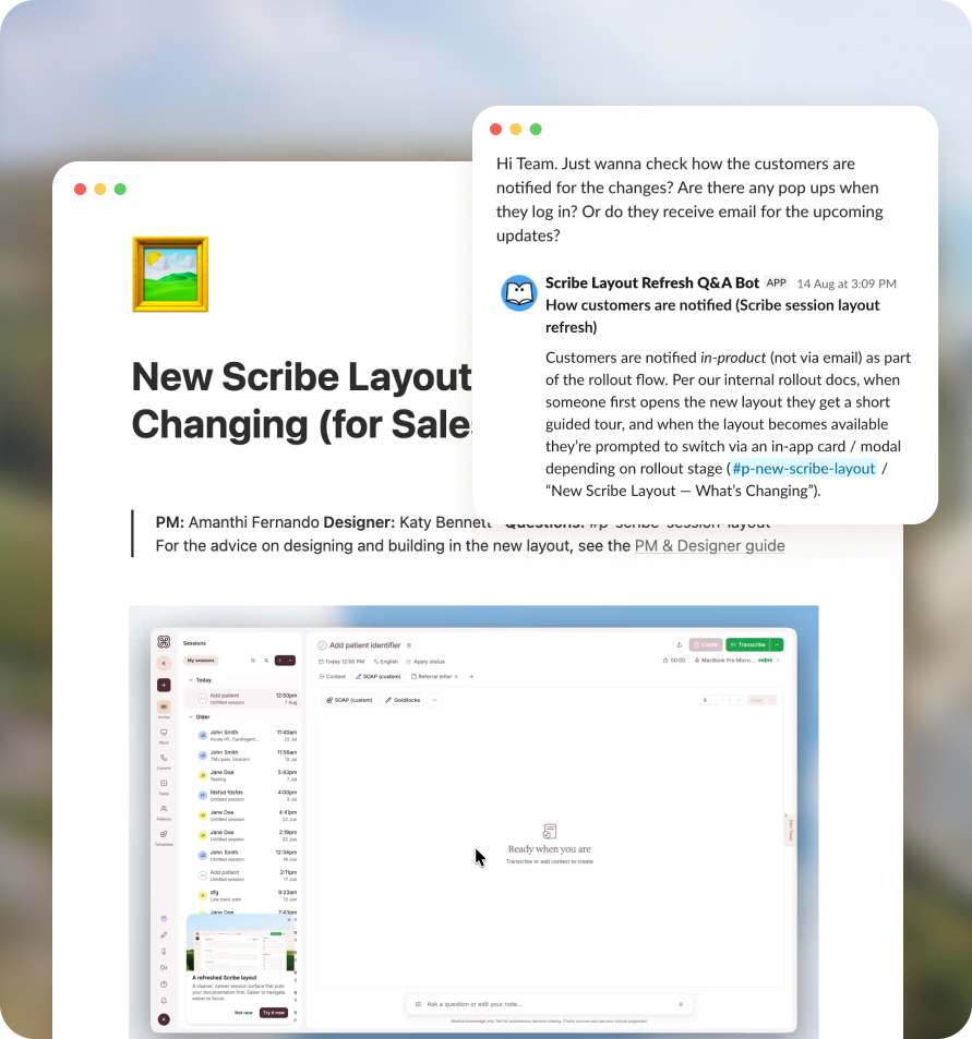
I also worked with customer-facing teams to prepare for the transition, creating demo videos, launch materials, version-specific documentation and a Q&A agent that helped Support, Sales and Customer Success answer questions confidently.
Impact
The impact
The redesigned experience made functionality easier to discover and helped clinicians complete more of their workflows within Heidi.
Feature discovery
- 0×Patient profiles viewed
- 0×Documents exported
- 0×Tasks completed
- 0×Templates opened
- 0×AI helper usage
Workflow outcomes
- +0%7-day retention
- +0%Additional content created
- +0%Sessions completed
Details
The microinteractions
Small moments of motion carry the system's personality: status, presence and feedback at a glance.
Reflection
Learnings & reminders
Don’t wait for a brief to solve a problem. This project reinforced that designing for the future is just as important as solving for today, and that strong design leadership means moving constantly between the big picture and the smallest details. Bringing people along is essential, but alignment in a workshop doesn’t automatically translate into alignment in practice. You need to give people the context, tools and ownership to make good decisions when you’re no longer in the room. Most importantly, a vision needs someone to maintain momentum, navigate competing priorities and protect it from being diluted as it becomes reality.